Sennep
Sennep is the studio I worked from 2007 till the end of 2011, and as the main senior designer, or art director if you like, I was in charge to redesign their identity.
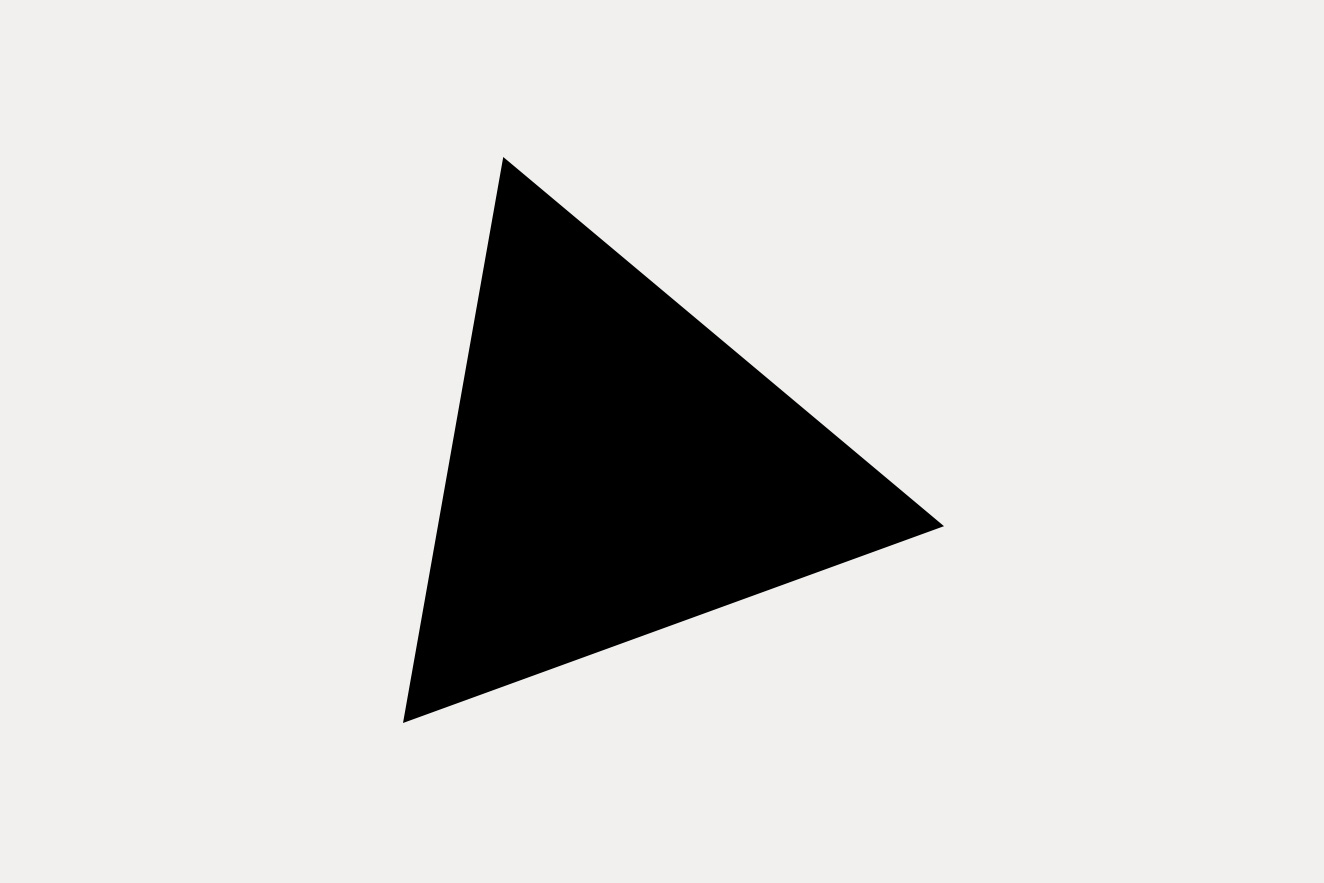
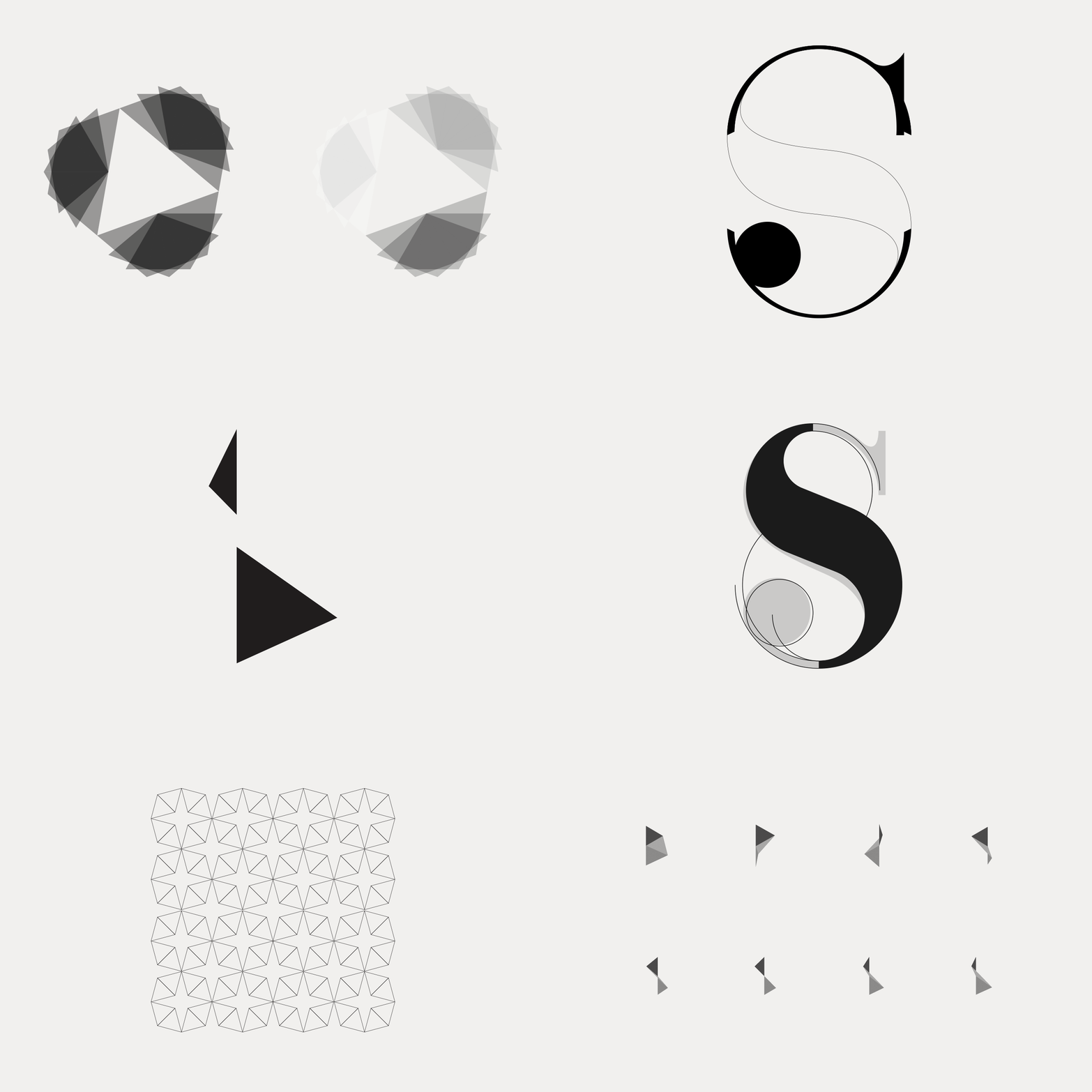
The logo is a simple black triangle – the most basic shape that you could design – which, almost like a creative seed, can be combined with other triangles to build more complex and beautiful fluid forms. The 20 degrees rotation give to the triangle a unique dynamic property.
Identity, few websites never gone live and love — sennep.com

